Dual-screen Android OS and core apps
Designing an interaction language for a form factor that didn't have one.
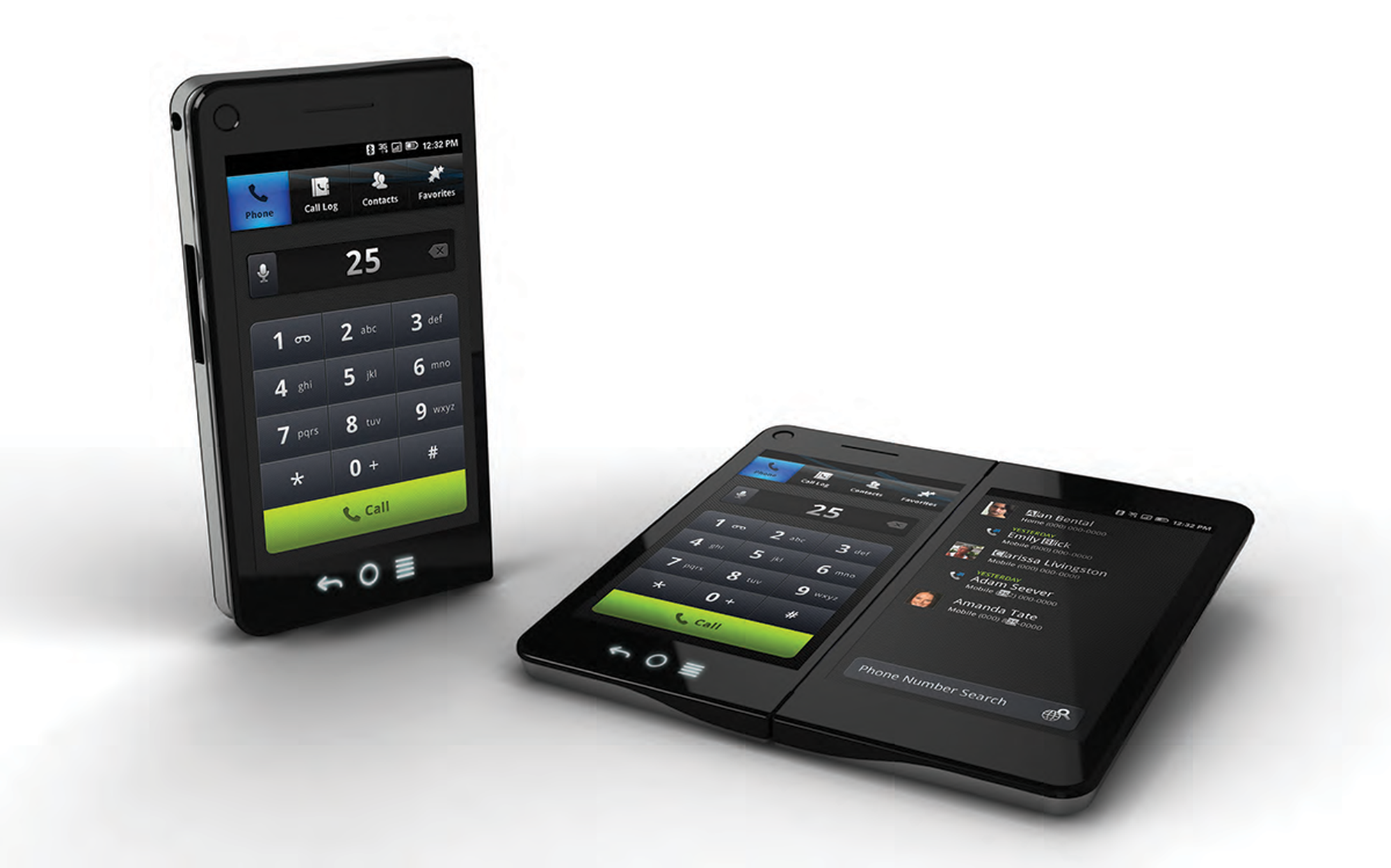
Flextronics was building an Android phone with two screens that worked folded closed or side by side.
Define how windows, gestures, keyboards and core apps behave across one screen or two, so developers could extend the system consistently.
I developed the windowing and application models and interaction guidelines, and designed the phone, contacts, messaging and media apps; Flex's designers and developers built the OS and apps from those specs.
Imerj and frog showed the phone publicly in 2011; it was built but never released commercially, and the work produced four U.S. patents.
The design problem
How do you design for a form factor that doesn't have any conventions yet?
A dual-screen phone doesn't just double the screen; it fundamentally changes the relationship between the user and their applications. Every assumption needed to be reconsidered. How do apps launch? Where do they appear? What happens when you close or open the device? How do you move content between screens? How do you avoid overwhelming users with complexity while still offering the potential of two screens?
Once those questions had system-level answers, the framework had to prove itself by designing the applications that would live inside it. A framework that worked in the abstract but couldn't carry a real phone call, a contact list or a music library would be worth nothing.
Two screens means twice the apps, twice the configuration, twice the controls. Let users decide how to use the space.
The user shouldn't have to manage “two-screen state.” The system handles the complexity, not the user. The system could be very complex; the user should never feel it.
What I designed
A system-level framework, four application models and five applications.
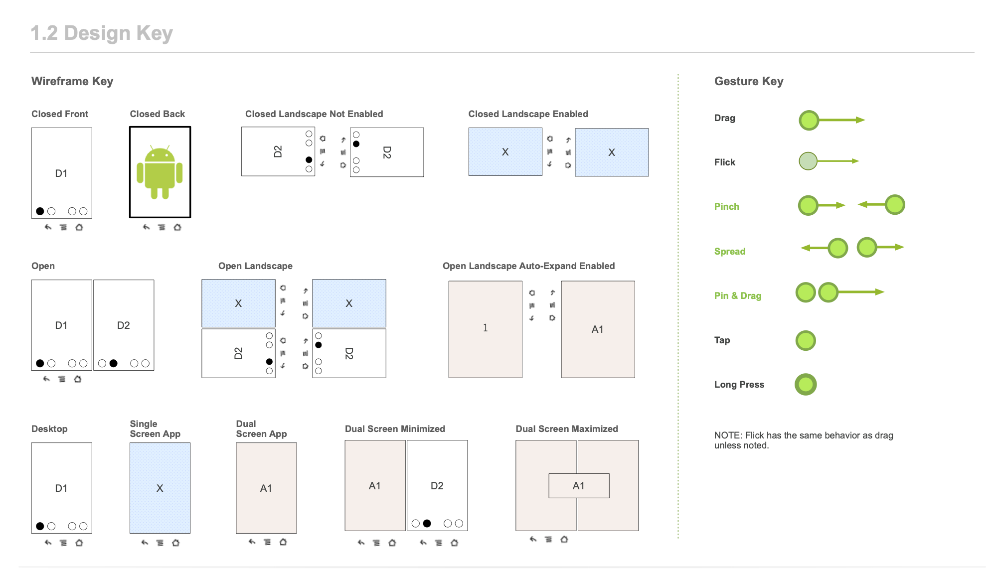
The Windowing Model handled application placement across single and dual modes: repositioning, maximizing, minimizing and stacking apps on each screen. Four application models gave developers a clear framework for how any app could use dual screens. A custom gesture language introduced three new gestures alongside standard Android ones, deliberately limited to avoid cognitive overload. Orientation guidelines kept rotation simple and predictable, and global patterns covered copy and paste, drag and drop, and a universal clipboard that works across screens.
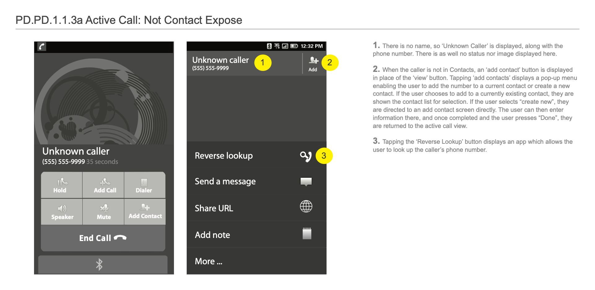
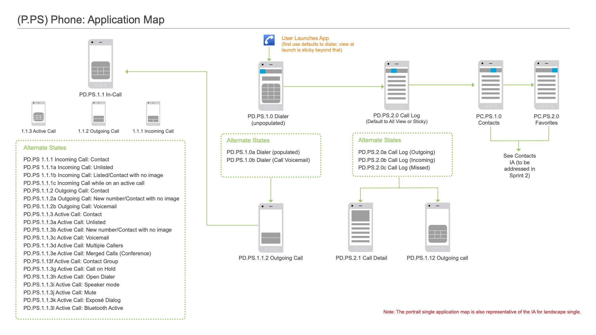
Five core applications (Phone, Contacts, Messaging, Photos and Music) each proved a different application model in use. They were documented with the same rigor: design concepts and rationale, application maps, wireframes for every screen and state in each orientation and screen configuration, and step-by-step flows with interaction details.
What I deliberately did not build
The places where “give the user more options” would have been a worse design.
The framework's strength came from restraint. Each rejection is a place where exposing more capability and more configuration would have multiplied the user's cognitive load without giving them anything they actually wanted.
- Rejected
Configuration screens exposing every dual-screen optionThe temptation with two screens is to let users decide which app goes where and how they pair, with a settings screen for every combination. Instead the system made those decisions through the four application models, and users got predictable behavior instead of a settings panel.
- Rejected
An unlimited custom gesture vocabularyThree new gestures (pinch, spread, and pinch-and-drag) sat alongside the standard Android set. More gestures would have given developers more expressive range but given users more to memorize. The gesture language was kept deliberately small.
- Rejected
A single-screen default modeThe dual screen wasn't treated as an extra mode for advanced users. The two-screen behaviors were designed to feel native rather than reserved for power users.
- Rejected
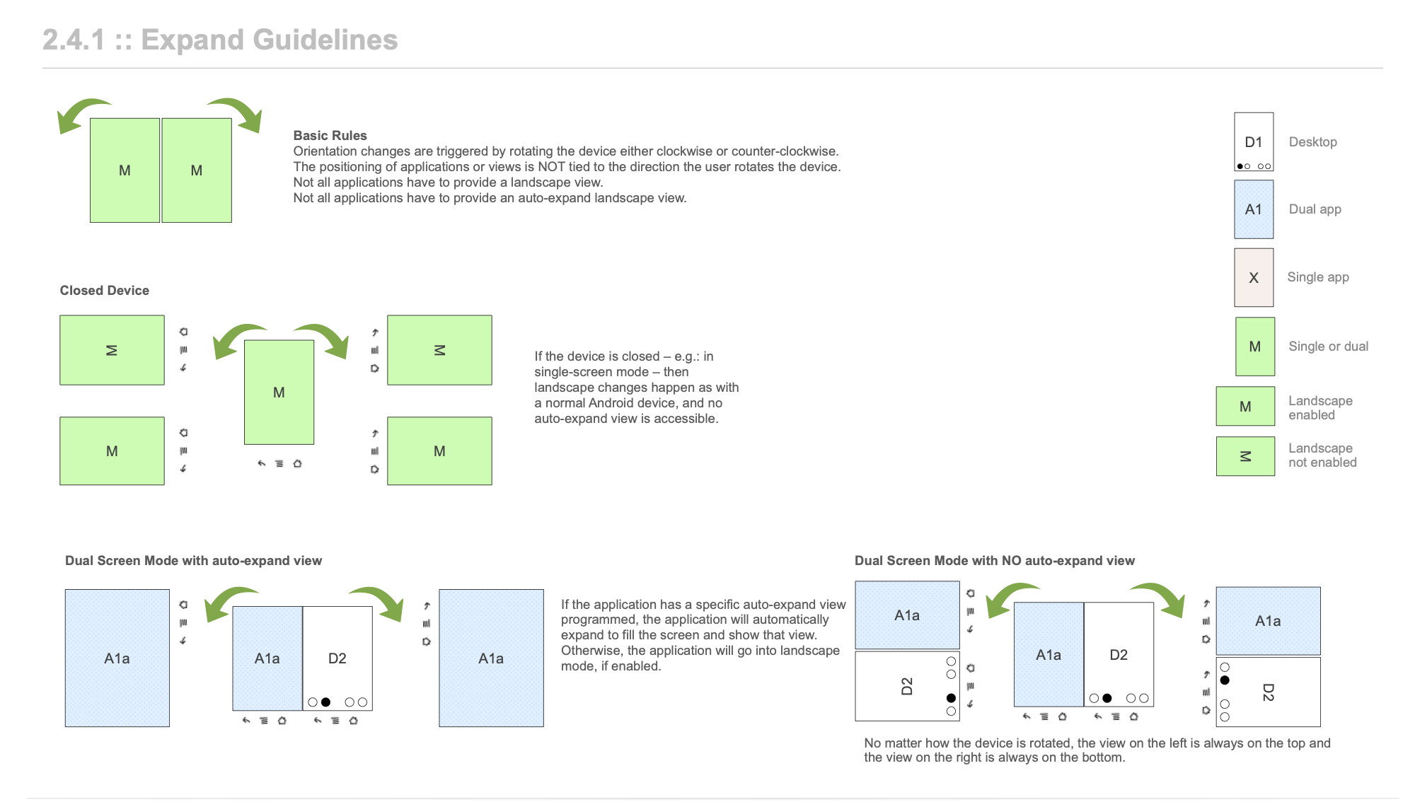
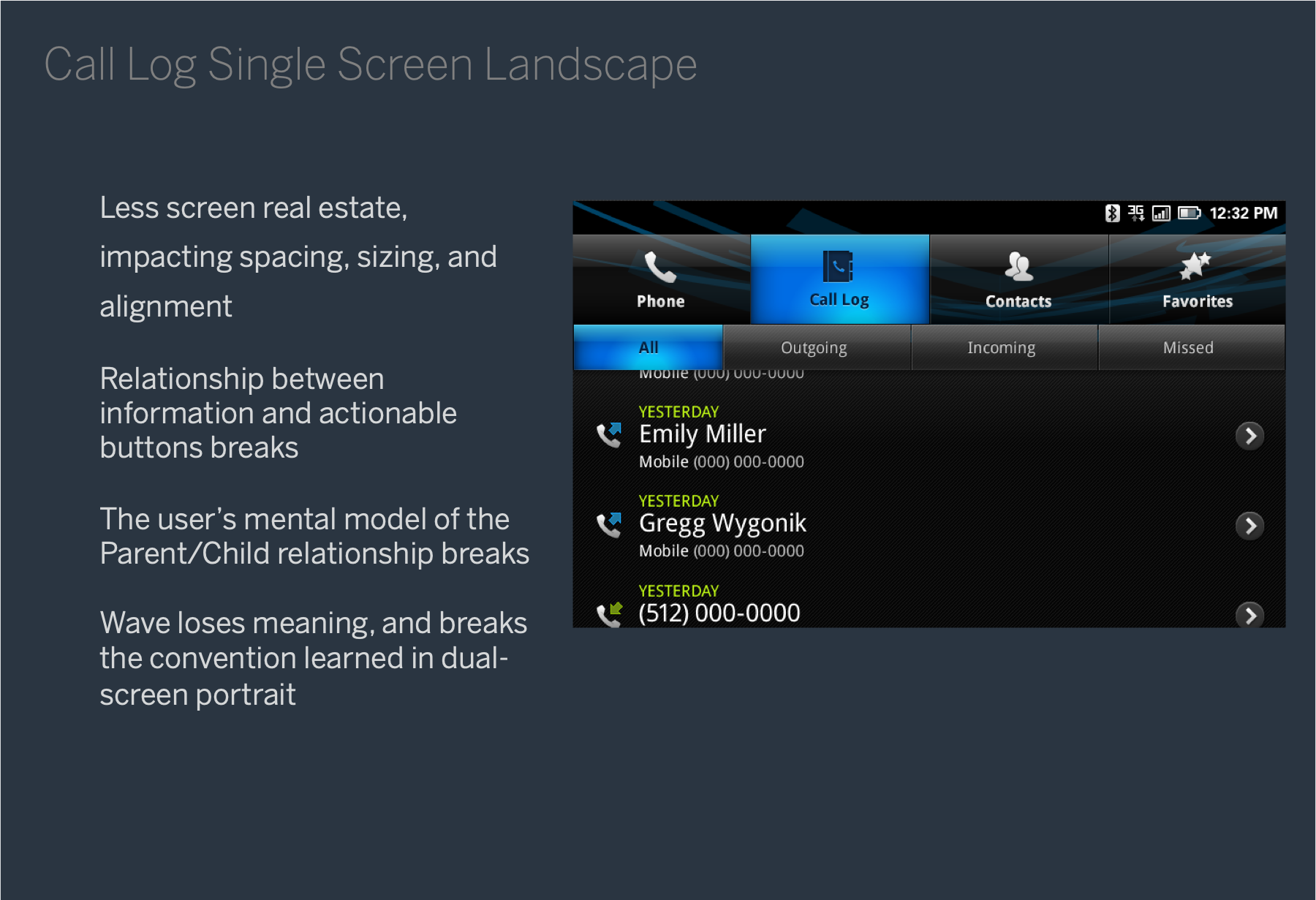
A generic landscape mode treated like any other rotationLandscape on a dual-screen device is not the same as landscape on a single-screen device: the two screens join into one wide canvas, which is a different relationship with the content. Landscape got its own rules, so the conventions learned in dual-screen portrait didn't simply break.
How it works
System-level rules. Application-level proof.
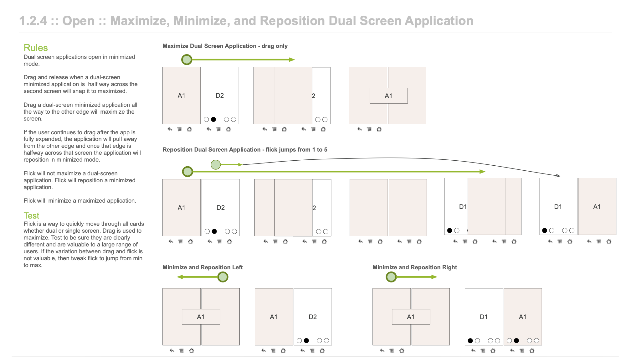
Window Positioning Model
A lightweight windowing system for mobile that managed application placement across single (closed) and dual (open) modes, with rules for repositioning, maximizing, minimizing and stacking applications on each screen, and for what happens to the second screen's app when the device closes and opens again.
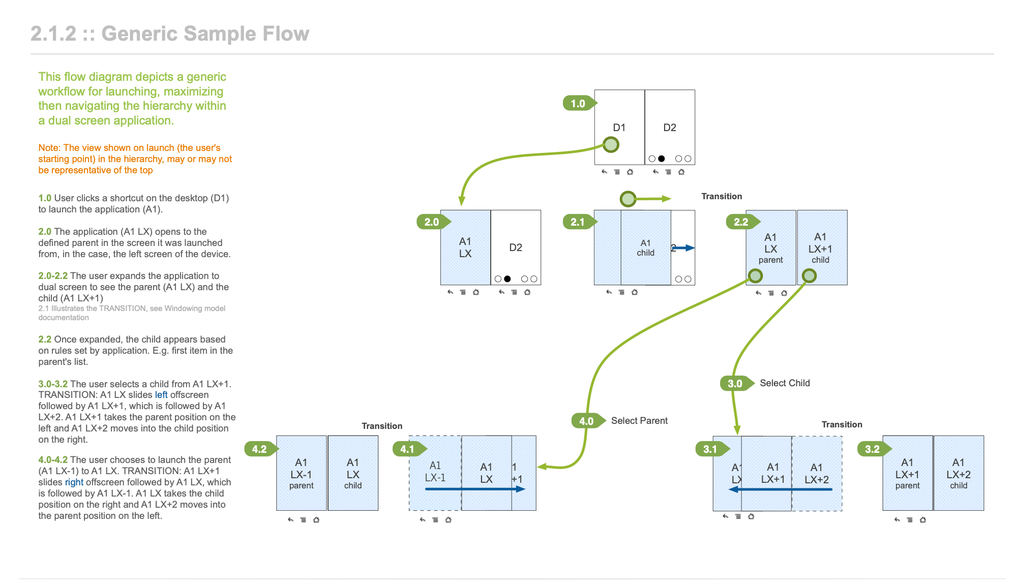
Four application models
Parent/Child handled hierarchical navigation, with a list on one screen and its detail on the other. Parallel View showed simultaneous views of the same content, such as a map beside directions. Exposé surfaced controls and shortcuts on one screen, leaving the other entirely for content. Expand let a single app stretch across both screens when the user wanted more room.
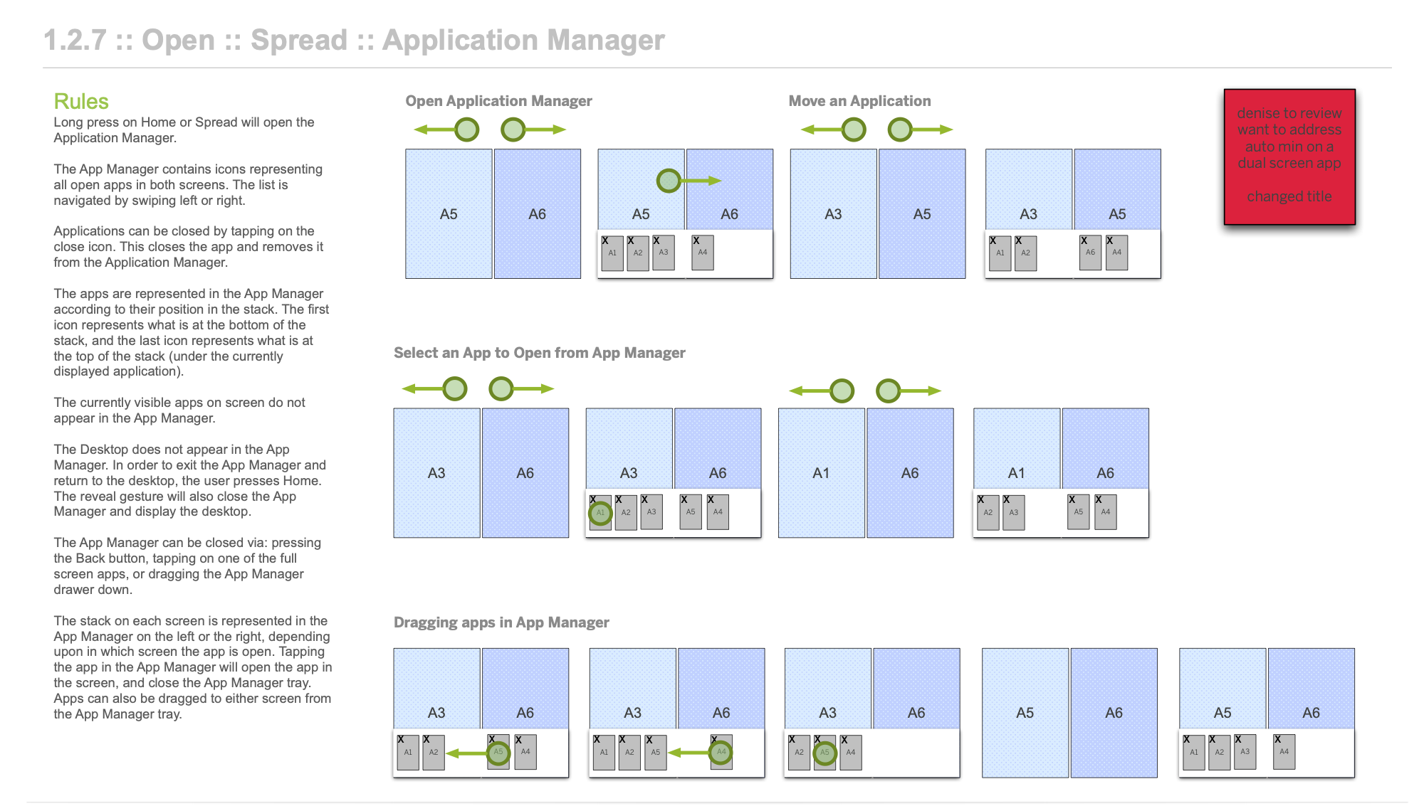
Custom gesture language
Three new gestures complemented standard Android ones. Each was mapped to a specific behavior in both single and dual-screen modes: swapping screens, opening the application manager to see what's open on each screen, and moving apps between screens in a way the user didn't need to think about.
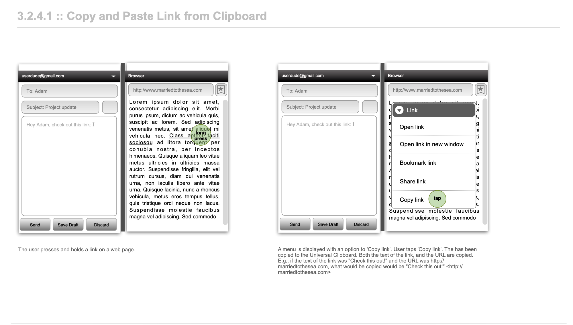
Global interaction patterns
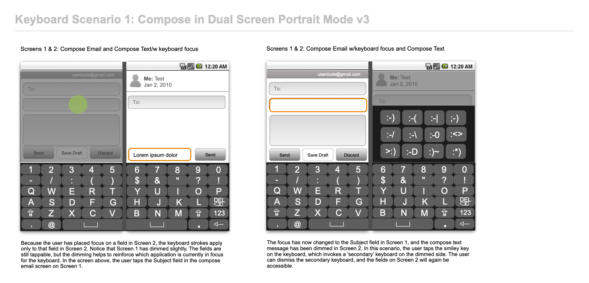
Text entry, copy and paste, drag and drop, and a universal clipboard designed for a two-screen context. Content could move between screens and between apps in the same way, no matter which app was on which side.
Application suite
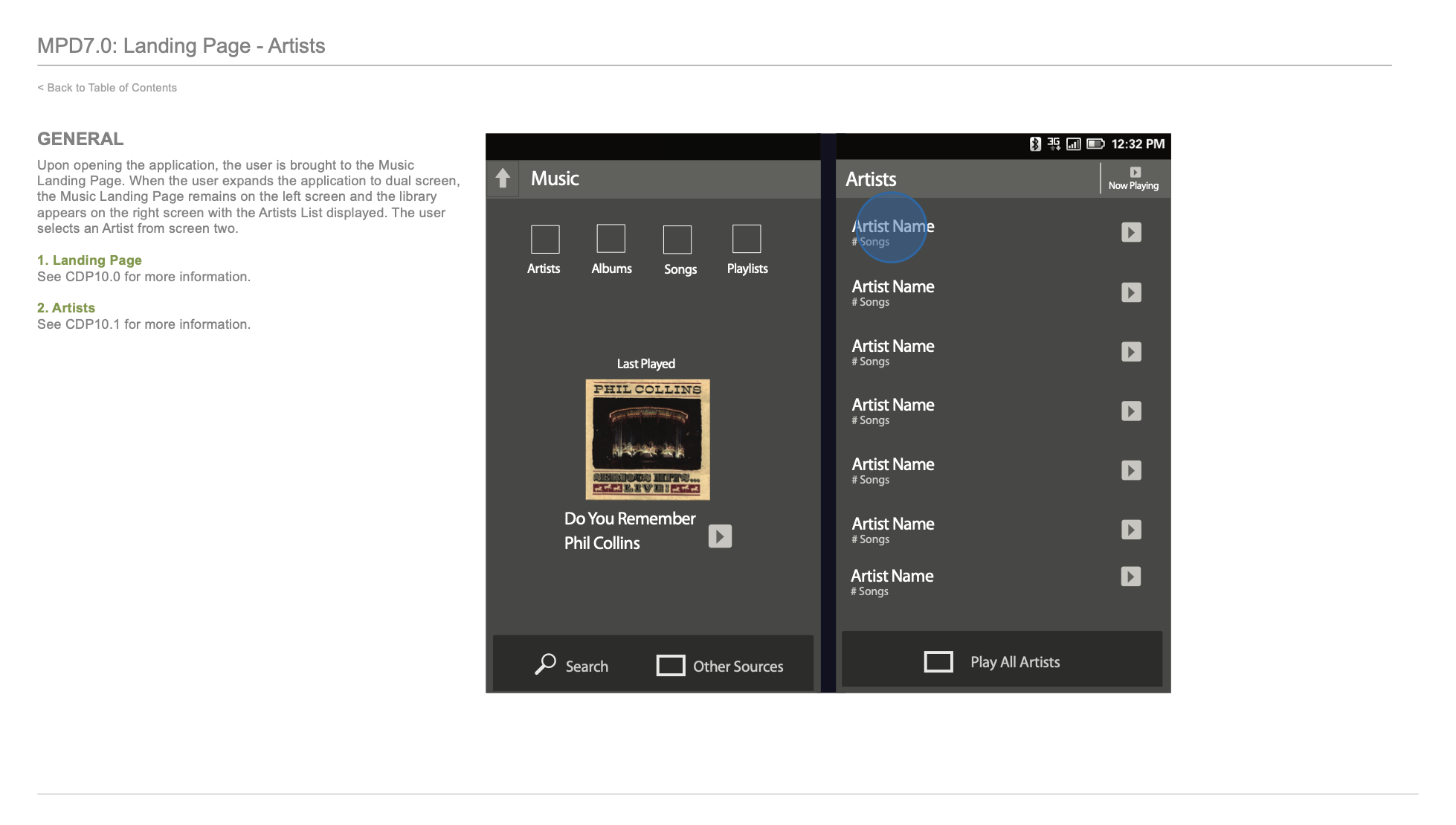
Phone used the second screen as a contextual workspace during a call: contact details, notes and quick actions. Contacts used Parent/Child navigation; Messaging kept the conversation list and an active thread visible together; Music kept the library and playback controls side by side. Each app proved a different model in use.
Result
A framework that anticipated what later foldable and dual-screen devices would face.
Four patents resulted from this work.
- PatentDesktop reveal by moving a logical display stack with gestures
- PatentMethod and system for viewing stacked screen displays using gestures
- PatentMethods and systems for presenting windows on a mobile device using gestures
- PatentUniversal clipboard
From the work
4 more pages from the original deliverables · select to enlarge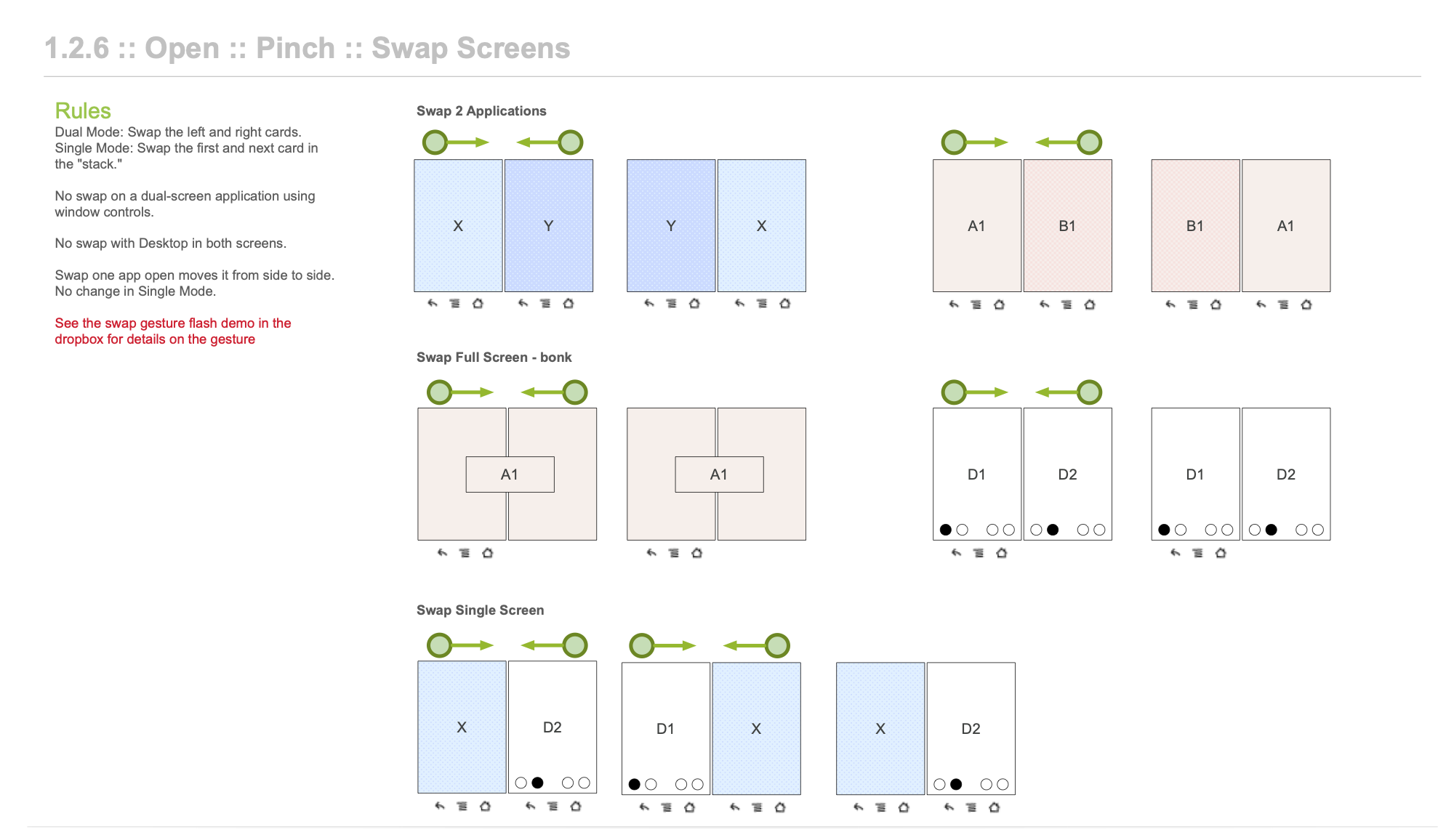
Deliverables
- Sprint 1 design review: hero flows (email, file manager, keyboard)54 pp
- Interaction guide: windowing, application models, interaction patterns168 pp
- Landscape orientation discussion8 pp
- Phone app design184 pp
- Contacts app design251 pp
- Messaging app design86 pp
- Firefly: capture (photo) concepts39 pp
- Firefly: browse and consume (music) concepts126 pp
Full decks and specifications available on request.
Redacted for client confidentiality.
mistycripps@protonmail.com