Smartwatch running app
Designing a complete running experience for a tiny screen, a moving user, and a runner who wants more data, not less.
Most mobile UX patterns assume someone looking at the screen; a runner glancing at a fitness watch mid-stride is a different problem.
Design a complete running app for the watch: run setup, GPS acquisition, in-run interaction, post-run summary and run history.
I tested concepts with runners on a treadmill, then designed the interaction model, four in-run views and every flow from setup to history.
The design problem
A running watch isn't a phone strapped to your wrist.
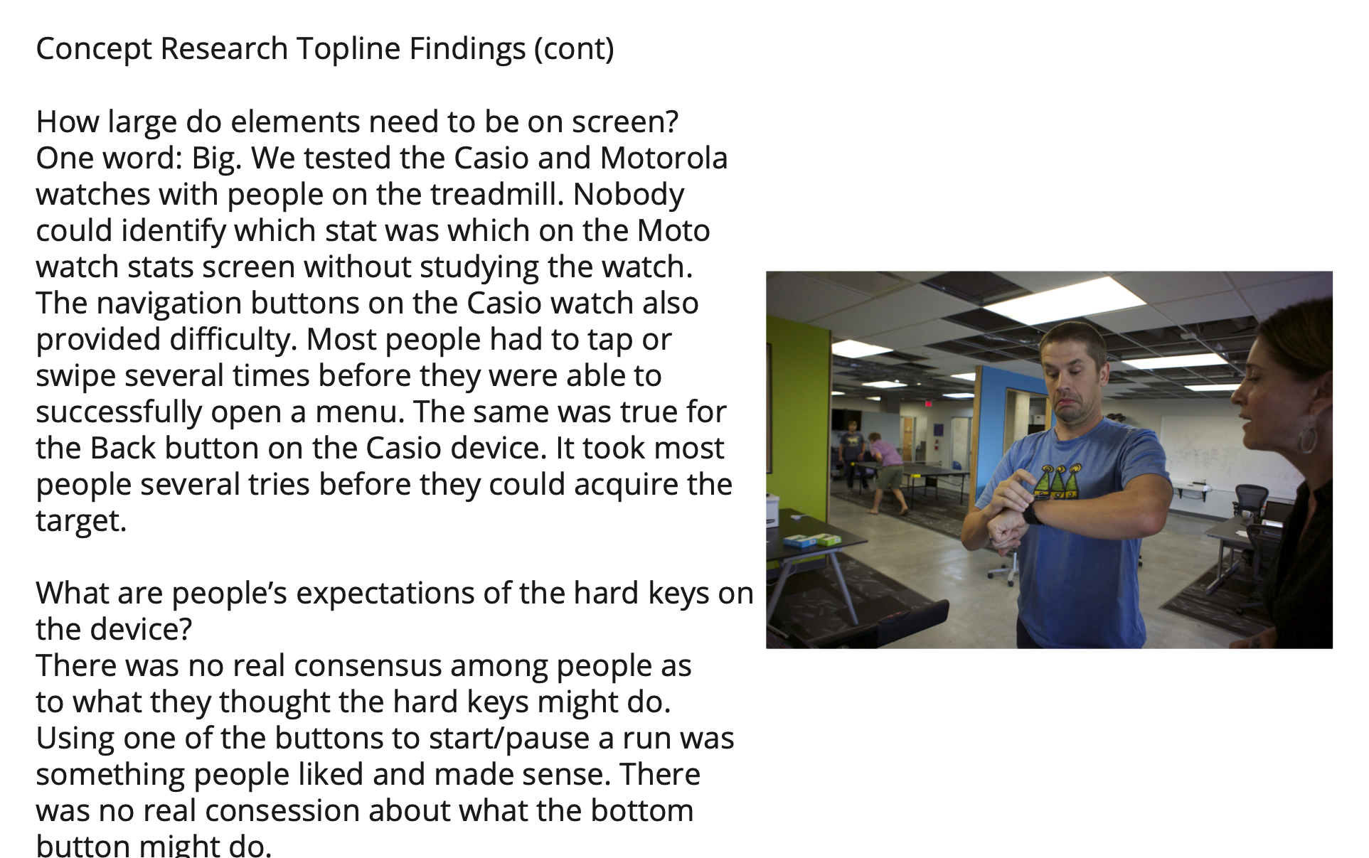
The screen is small and touch targets are hard to hit. The runner is moving, so a glance is all they can spare, and sweaty fingers make touch unreliable, which turns physical hard keys into a primary input. Every interaction had to be judged by whether a runner could do it without breaking stride.
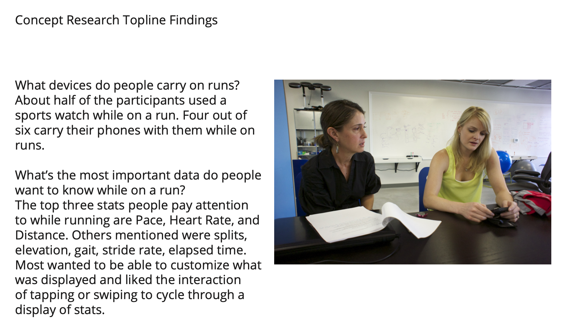
At the same time, runners wanted more data, not less. In testing, the stats they watched most were pace, heart rate and distance, followed by splits, elevation, stride rate and elapsed time, and most wanted to choose what they saw. The challenge was delivering all of that without an interface that demands focused attention.
Build a phone app with fewer controls. The patterns already exist, and mobile conventions translate to wearables.
The user is moving and can't focus. Small touch targets and sweaty fingers don't mix. The conventions are wrong for this device; the wrist is its own platform.
What I designed
Hard keys for high-stakes actions. Touch for moments of transition. Four in-run views the runner customizes.
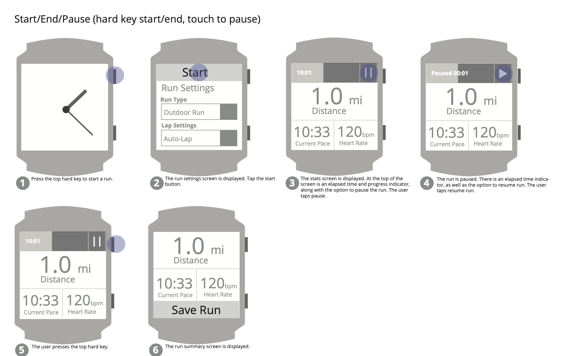
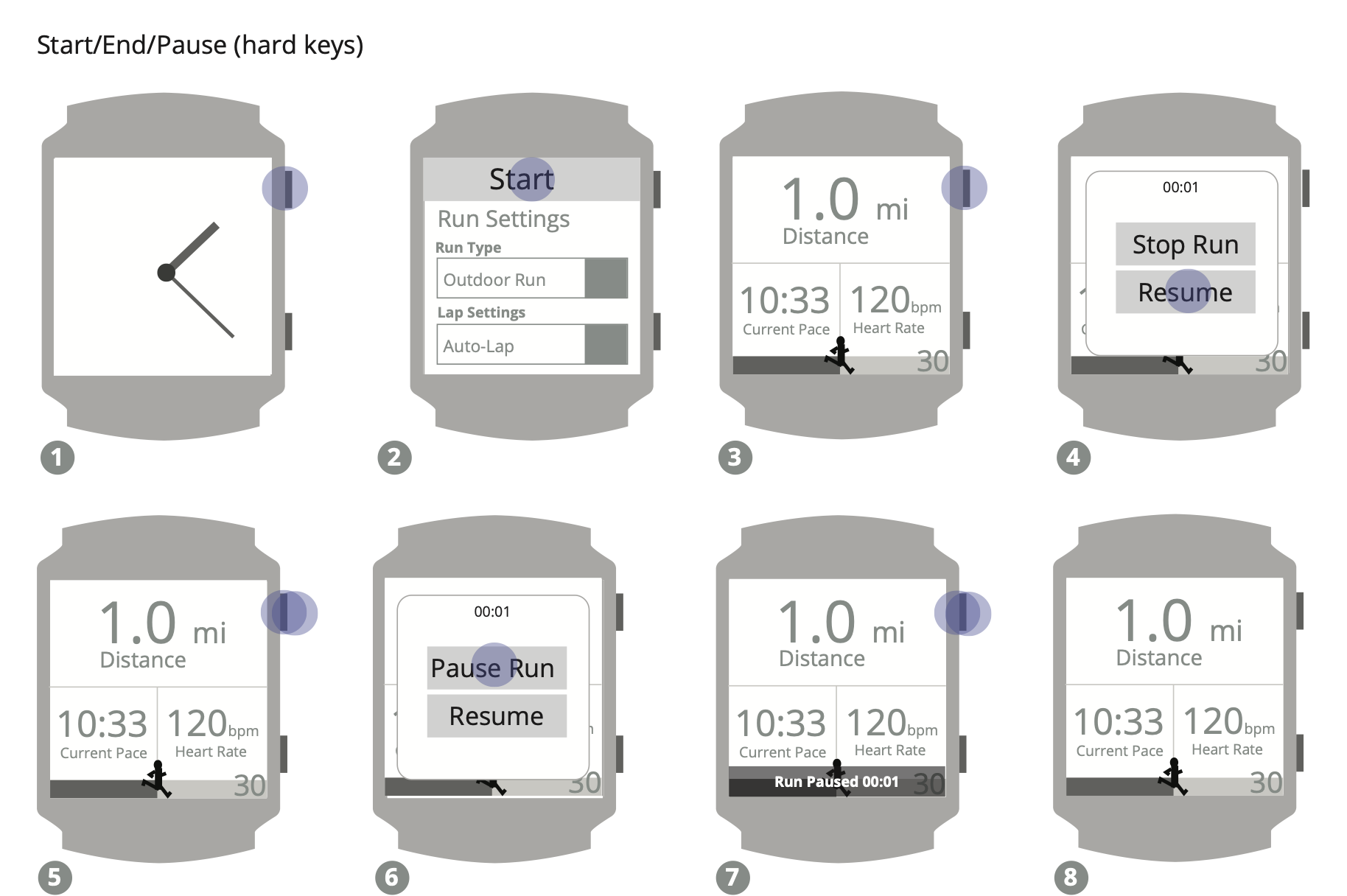
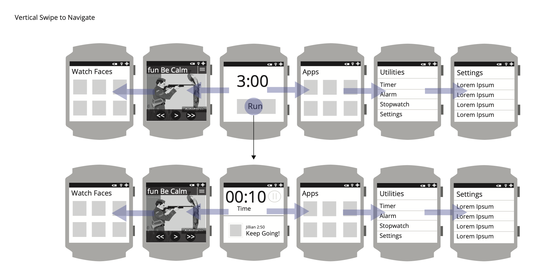
Start and pause live on physical hard keys, because they happen mid-run, when the runner can't aim at small touch targets. Ending a run moved to touch, at the moment the runner has stopped and is ready to see results. During the run, four views sit a swipe apart: stats in a customizable grid, a half map for a quick orientation check, a full map for street-level detail, and laps as a table of splits.
The model came out of concept testing that I planned and moderated. Six runners worked through two static prototypes and two existing sport watches on a treadmill, thinking aloud, then rated the experience in a survey. The findings shaped the interaction model.
What I deliberately did not build
The interaction choices that would have looked clever in a meeting and failed on a wrist.
Each one is a place where a more conventional or more elegant-seeming choice would have failed the runner. The decisions protect runner control, tactile certainty, and the fact that the runner usually isn't looking at the screen.
- Rejected
Single press to stop, double press to pauseAn elegant consolidation that introduced timing ambiguity. In concept testing, a double press was unreliable while a runner was bouncing along. Stop and pause became different inputs: pause stayed on the hard key, and ending moved to touch, after the runner had stopped.
- Rejected
Touch-only controls with collapsed and expanded statesThe point of a running watch is operating it without looking: start a run, glance at pace, dismiss a notification, all with eyes on the road. Hard keys for the actions performed in motion were non-negotiable.
- Rejected
Auto-discard, or a “save?” prompt at the end of a runRuns save automatically. The cost of accidentally losing a run outweighs the cost of an unwanted entry in history, which can always be deleted later.
- Rejected
Auto-share to social on completionA participant specifically mentioned not wanting to share a “bad run.” Sharing became opt-in and selective, with control over which details to include.
- Rejected
Blocking the run when GPS hadn't lockedThe 60-second GPS countdown is a soft gate, not a hard one. If acquisition fails, the runner can retry or run without GPS. Imperfect data is better than no run at all.
How it works
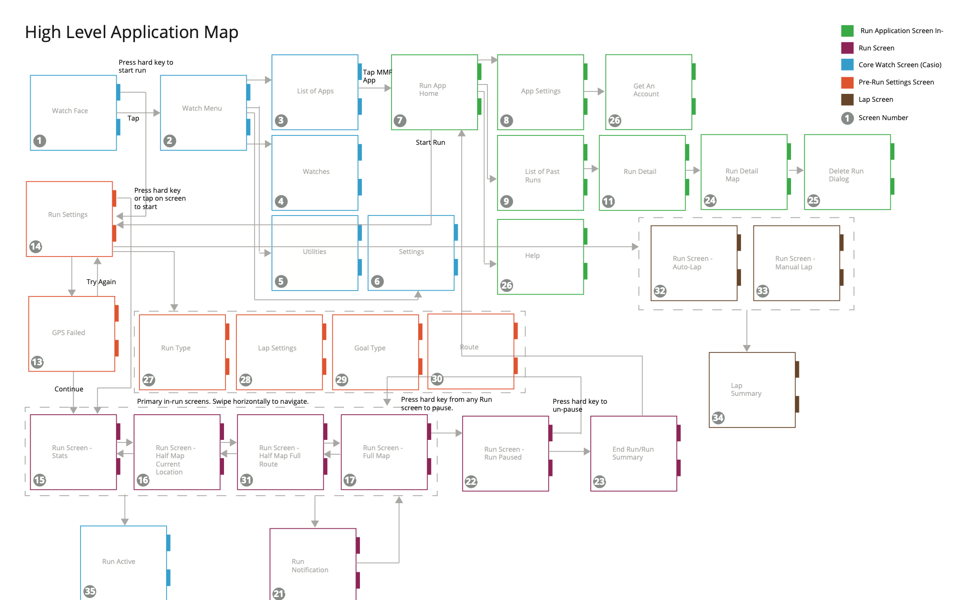
The complete app, end to end.
Interaction model
Four approaches to starting, ending and pausing were evaluated in concept testing. The final model uses hard keys for start and pause and touch to end, with an elapsed-time banner that serves as both status indicator and reminder. Tactile certainty for the actions performed while moving; touch for the moment the runner has stopped.
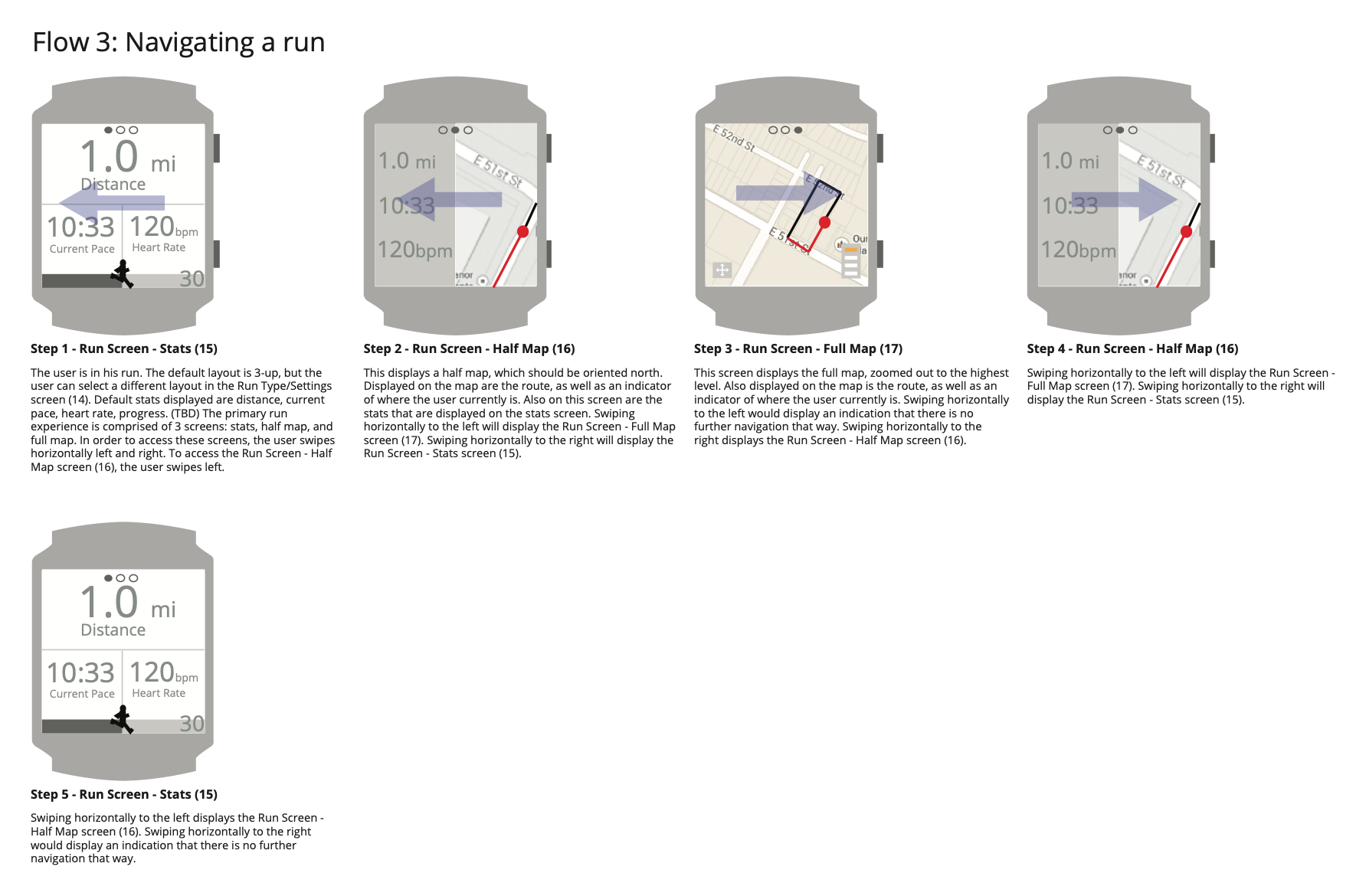
Four in-run views
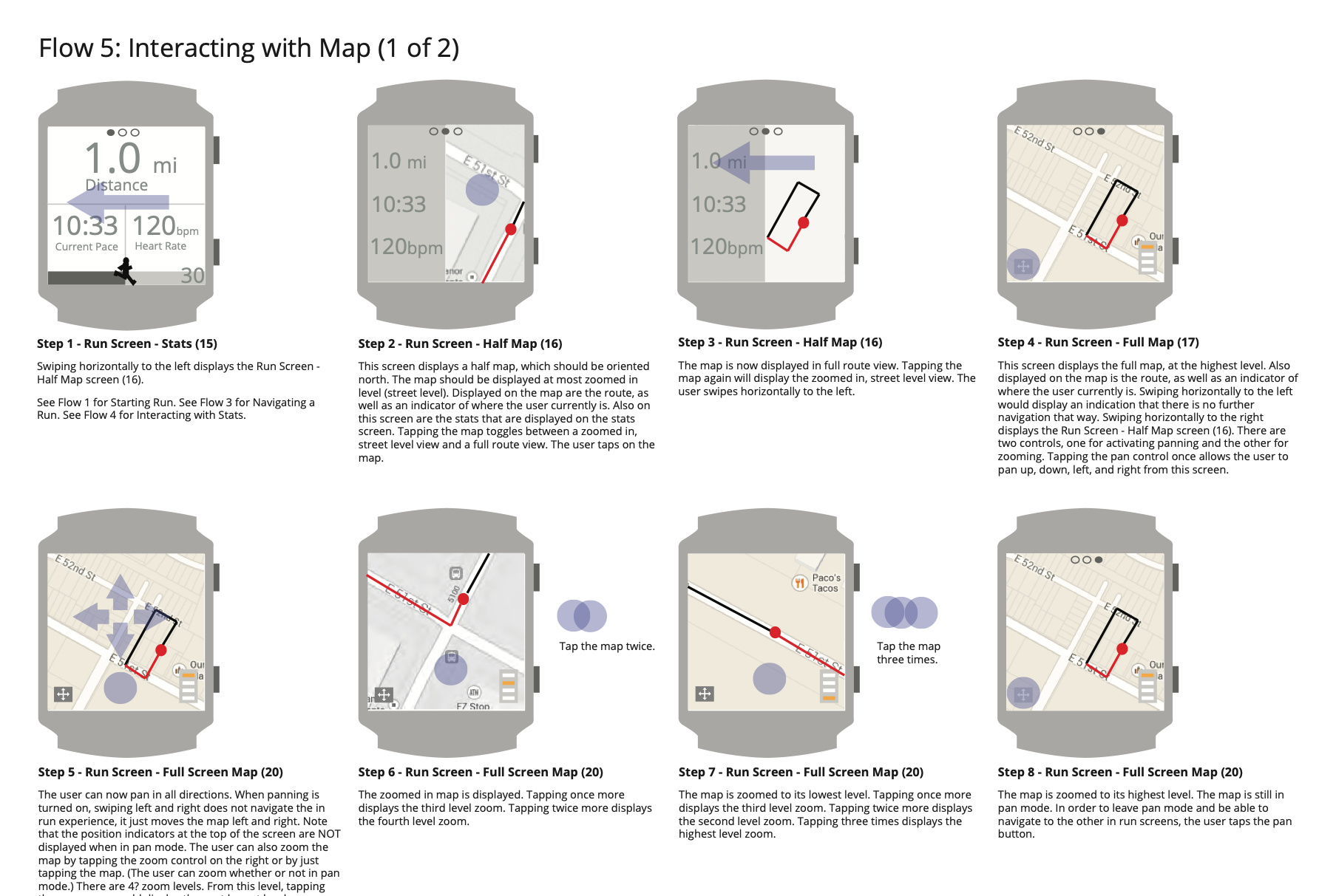
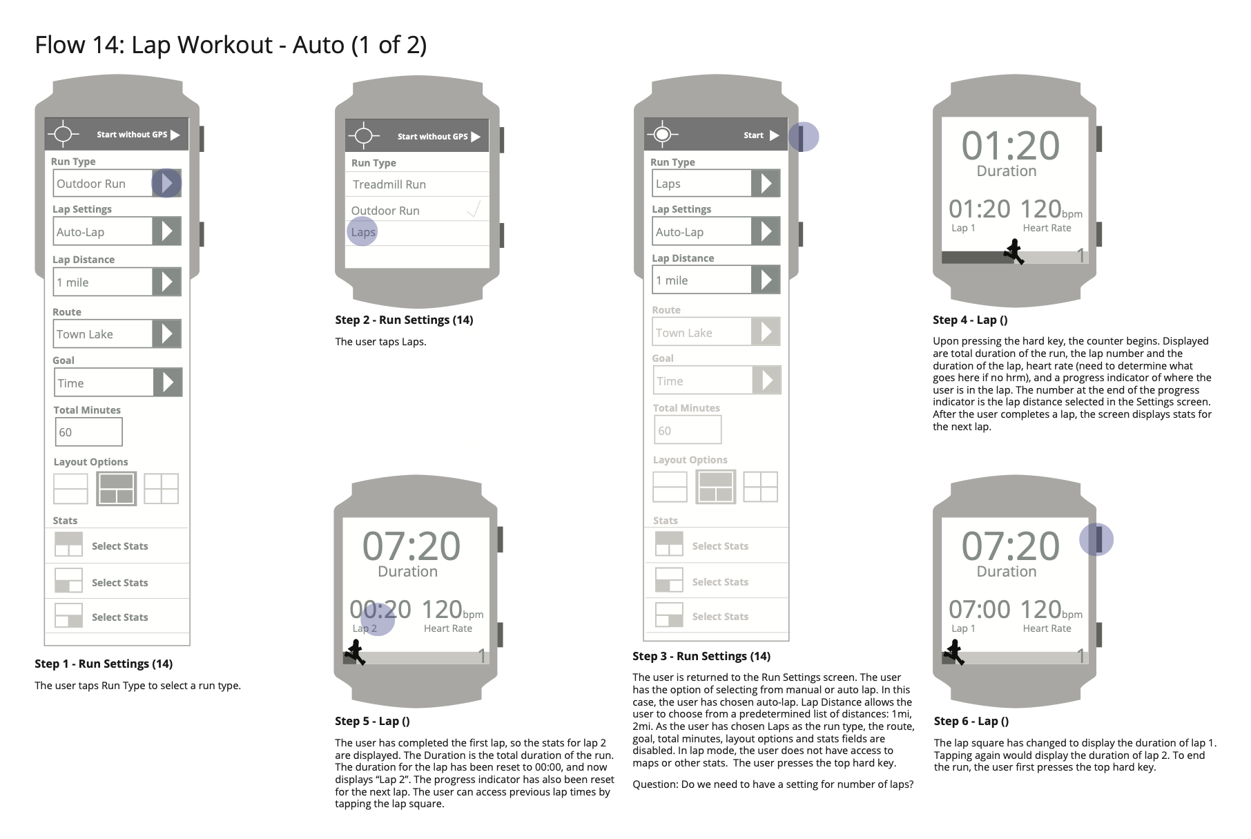
Stats default to a grid of the runner's chosen metrics, tappable to cycle through other data. Half Map gives a quick orientation check alongside live stats; Full Map supports pan and zoom, with markers like water fountains and restrooms. Laps shows a running table of splits, for auto laps by distance or manual laps by hard key, set up before the run.
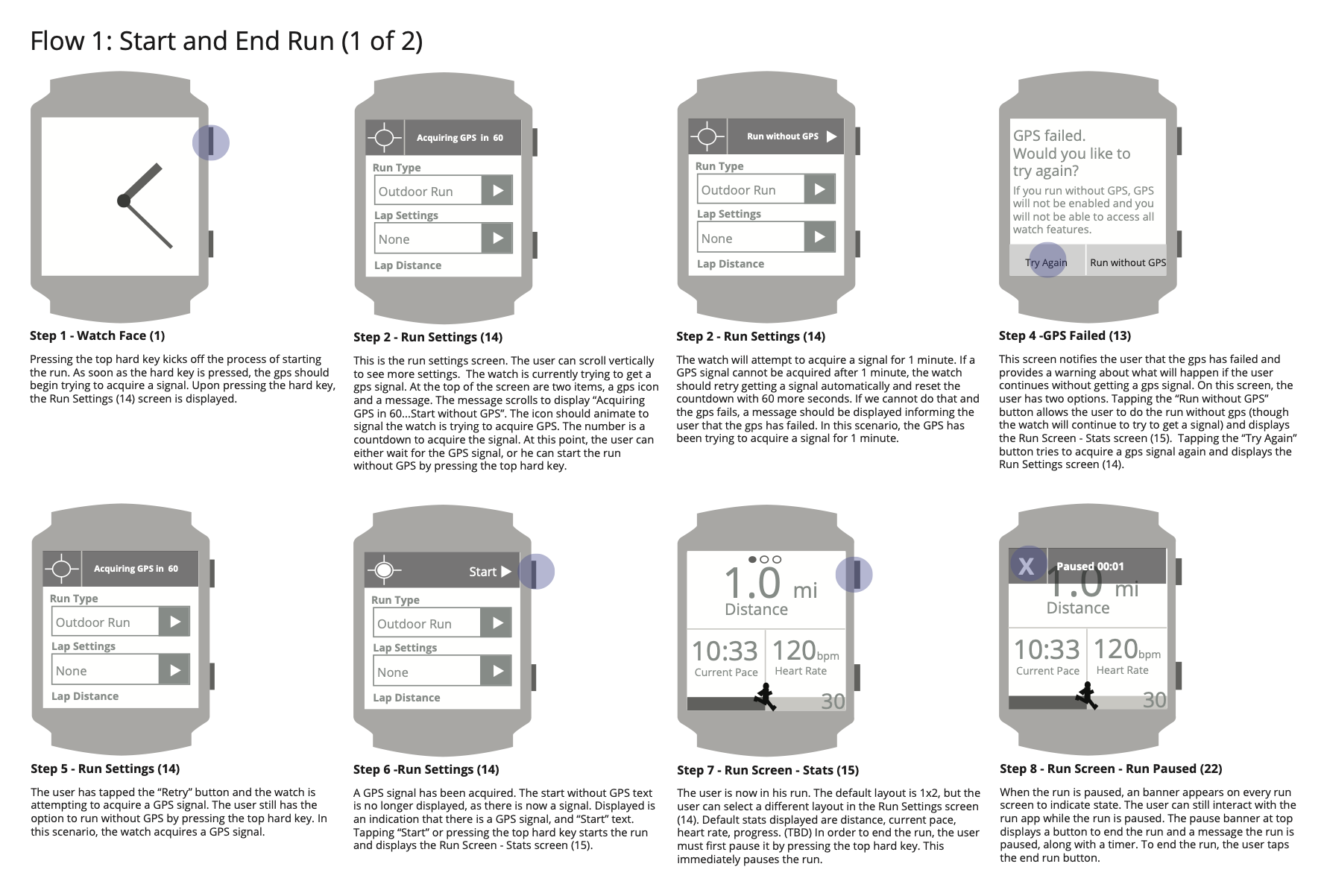
GPS acquisition with fallback
GPS lock is the unglamorous interaction that gates the whole experience. A countdown shows progress without demanding attention, with a retry if acquisition fails. The critical decision was the fallback: the runner can always start without GPS.
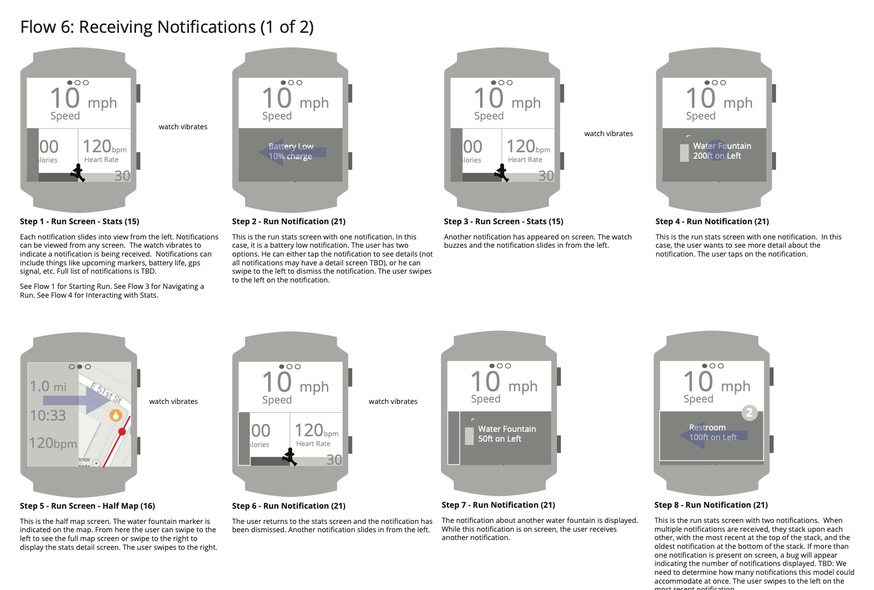
Notification strategy
Notifications slide in from the left and stack when several arrive: contextual alerts like a nearby water fountain, device alerts like low battery, and status updates. Auto-dismissing alerts were preferred, with tap or swipe to clear early. About half of the participants wanted landmark notifications along the route; most didn't want social notifications mid-run, so contextual alerts came first.
Run lifecycle
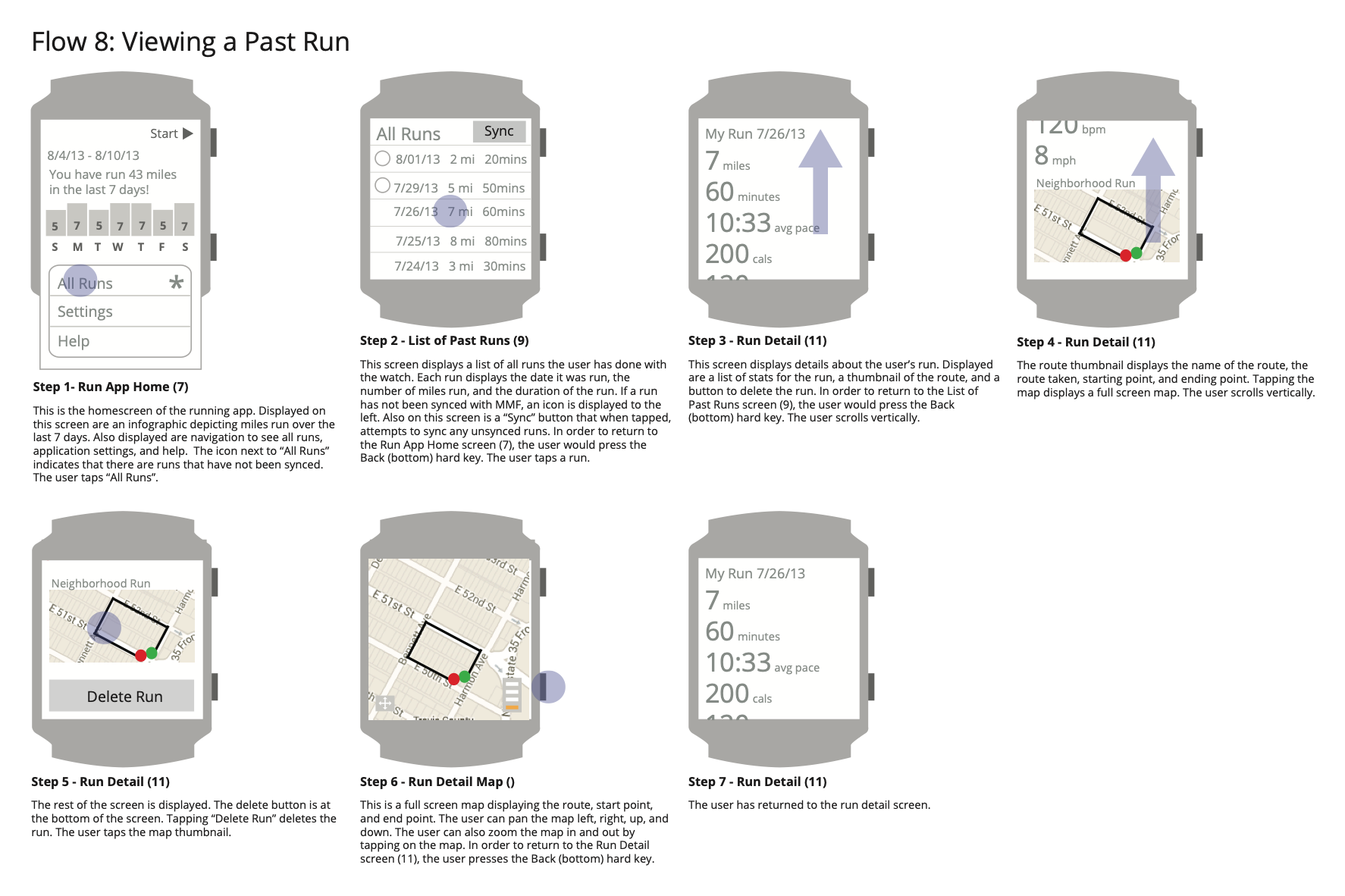
Run setup covers run type, lap settings, goal and stats layout. A summary appears as soon as the run ends, with key stats and the route, and sharing is opt-in. Past runs appear in a list with sync status, and each run's detail view mirrors the summary.
Result
A complete running app, reasoned through from first principles.
From the work
4 more pages from the original deliverables · select to enlarge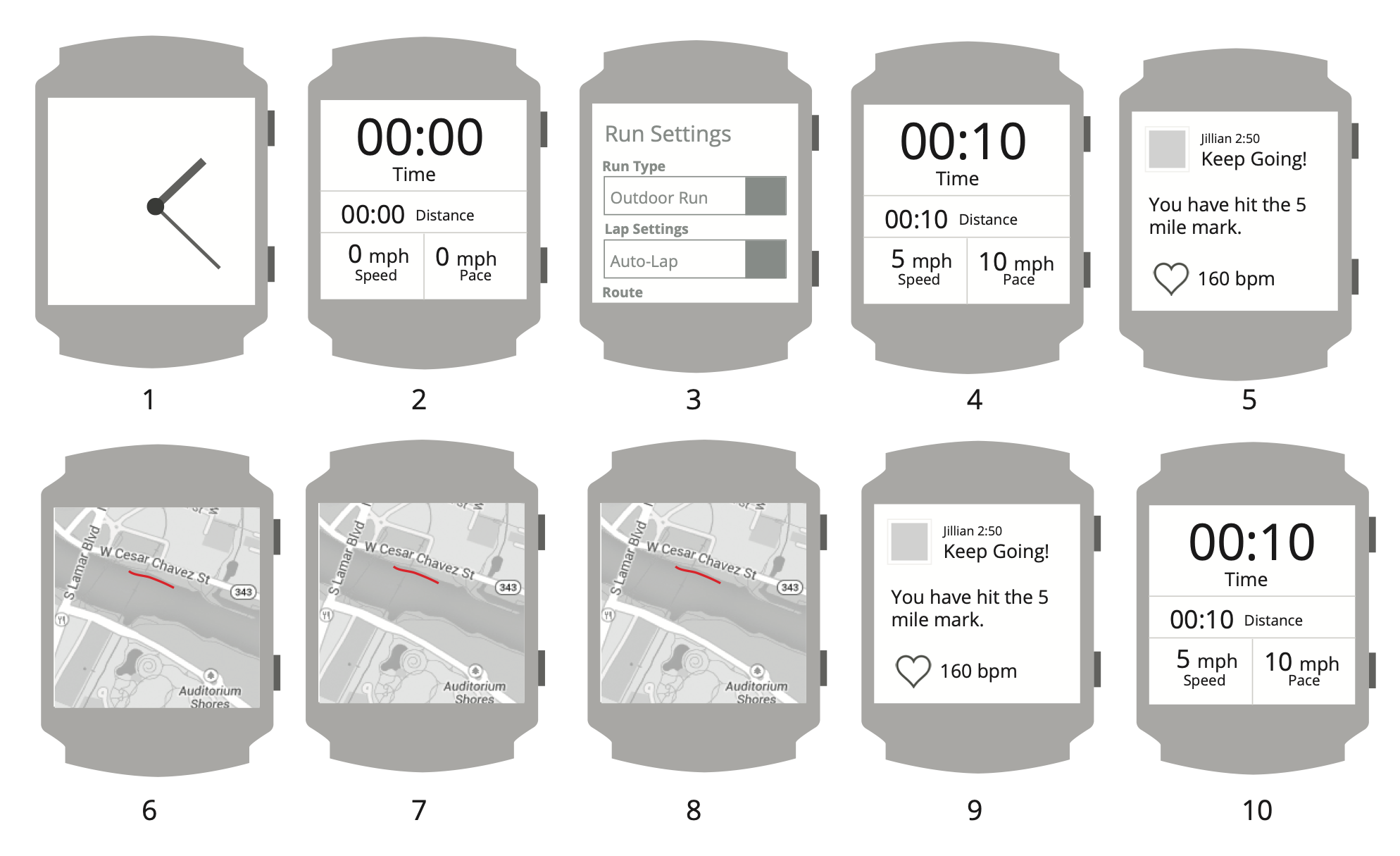
Deliverables
- Concept test plan and session script19 pp
- Concept research topline findings5 pp
- Concept explorations (several rounds)40 pp
- Running watch design: app map, 14 flows, screen inventory37 pp
Full decks and specifications available on request.
Redacted for client confidentiality.
mistycripps@protonmail.com